The Challenge
Partnering with the world's largest children's museum, our team redesigned the legacy "Paint a Warrior" interactive kiosk inside the National Geographic Treasures of the Earth permanent gallery exhibit.
The original Flash-based kiosk aimed to teach young visitors how archaeologists restored the natural colors of ancient China's Terra Cotta Warriors. However, the experience was outdated, confusing, and unresponsive. Children dropped off and abandoned the activity in under 30 seconds due to wordy instructions, linear steps, and a four-way mechanical joystick that felt counter-intuitive. Massive physical controls (like an oversized wheel) had zero visual connection to the digital screen, frustrating children and leaving accompanying parents with no way to scaffold the learning experience.
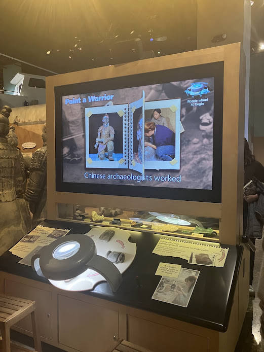 Figure 1: Kiosk & Friction Points in "Treasures of the Earth"
Milestone 1: Museum Research & Discovery Mapping
We opened with a structured, on-site field study before and during public museum operating hours. We recorded timed behavioral observations of children and caregivers, mapping dwell times, drop-off points, and verbal interactions. We paired this fieldwork with secondary literature on child cognitive stages and parent-child co-play stances.
- Early Abandonment: The average guest spent under 20–30 seconds before walking away. Over 70% of child visitors abandoned the interaction during the "Analyze Traces of Paint" step due to repetitive, unskippable screens.
- Physical-Digital Disconnect: Children naturally rushed to touch physical objects—specifically spinning the large wheel—expecting immediate on-screen feedback. When nothing happened, they assumed the exhibit was broken.
- The Parent Guidance: While children struggled with dense digital text, engagement skyrocketed when caregivers actively prompted them. We recognized that the kiosk needed to support co-play rather than solo interaction.
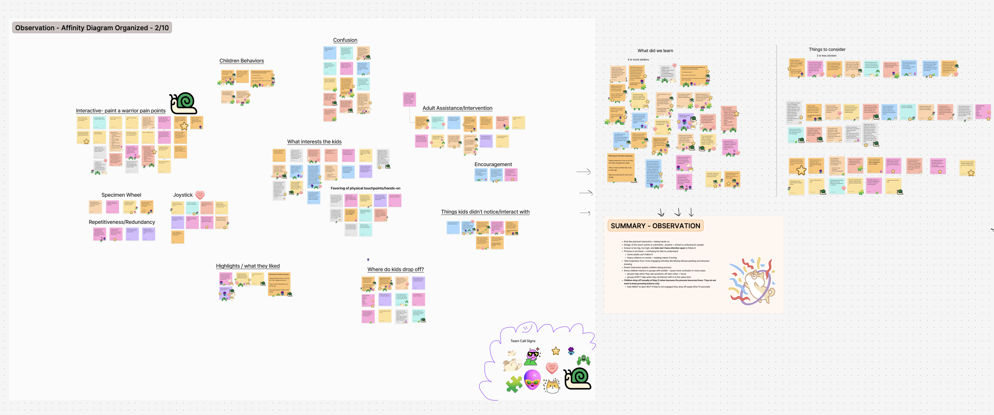 Figure 2: Thematic Affinity Clustering & Touchpoint Drop-off Mapping
Milestone 2: Design Ideation & Prototype Testing
Our team conducted two rapid sketching sprints, generating 37 concepts split across on-screen interactions and physical kiosk modifications. To solve the single-user bottleneck, we moved away from a single screen toward a Nintendo DS-inspired dual-screen layout: a top narrative display placed at adult eye height and a bottom interactive touchscreen placed at child height.
To test our concepts, we created a physical card prototype along with low-fidelity digital wireframes using the museum's monochrome "blueprint" format. We then spent a full testing day on-site with museum staff and children aged 8–13.
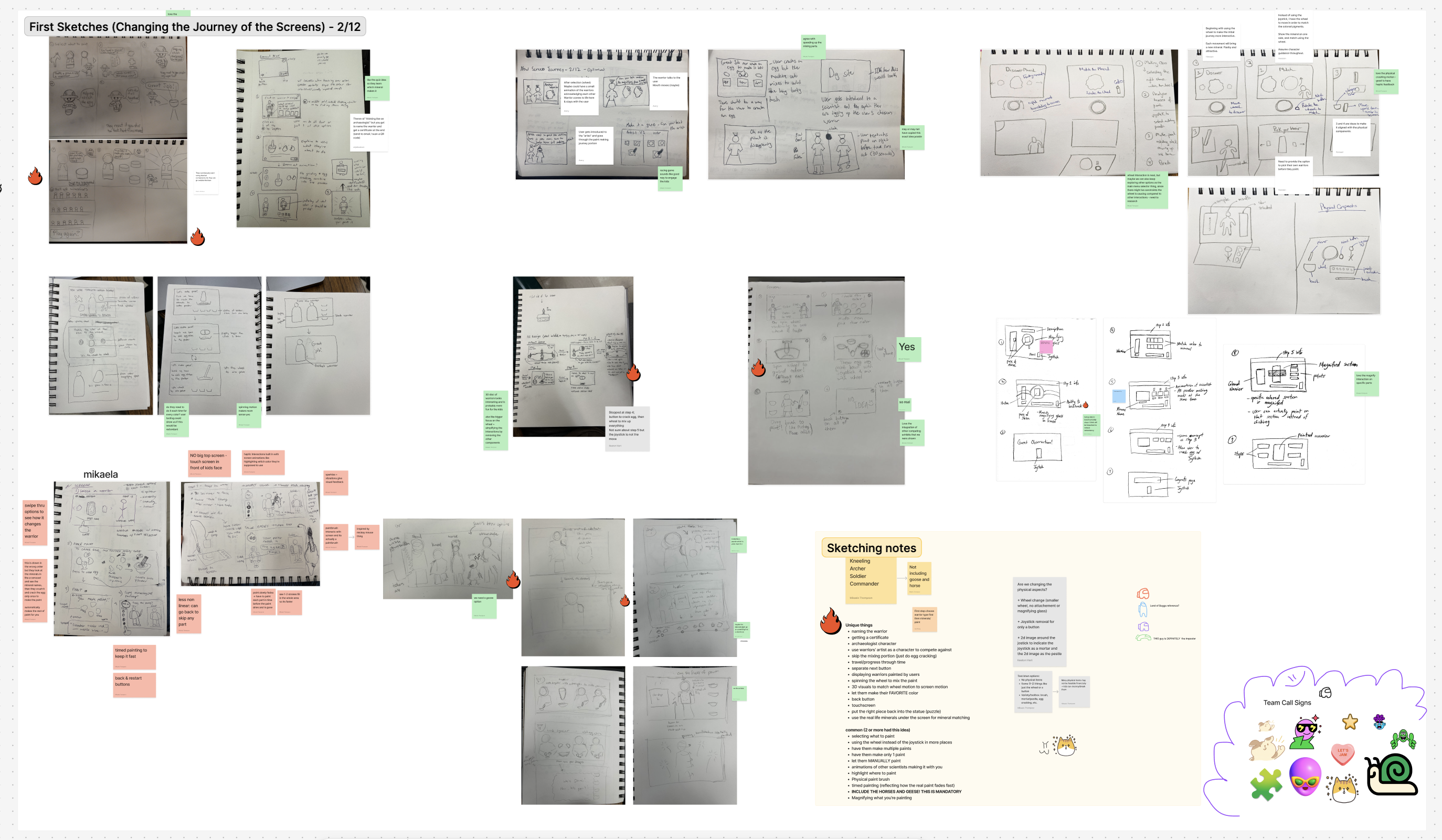 Figure 3: Early Concept Sketching Sprint: Tangible Tools & Dual-Screen Architecture
Key takeaways from on-site concept testing:
- A/B Layout Testing: We tested a 5-bowl physical mixing layout against a single unified bowl. 4 out of 5 staff members and all child testers preferred the single bowl for clarity, proving that simpler physical affordances reduced confusion.
- Tangible Tool Preference: Children unanimously preferred a paintbrush/pestle tool over the joystick, validating our hypothesis that children learn best through tangible, sensory-rich interactions.
- Guide Character Necessity: Children struggled with dry text prompts, so we introduced an illustrated Archaeologist Non-Player Character (NPC) to voice instructions and cheer progress.
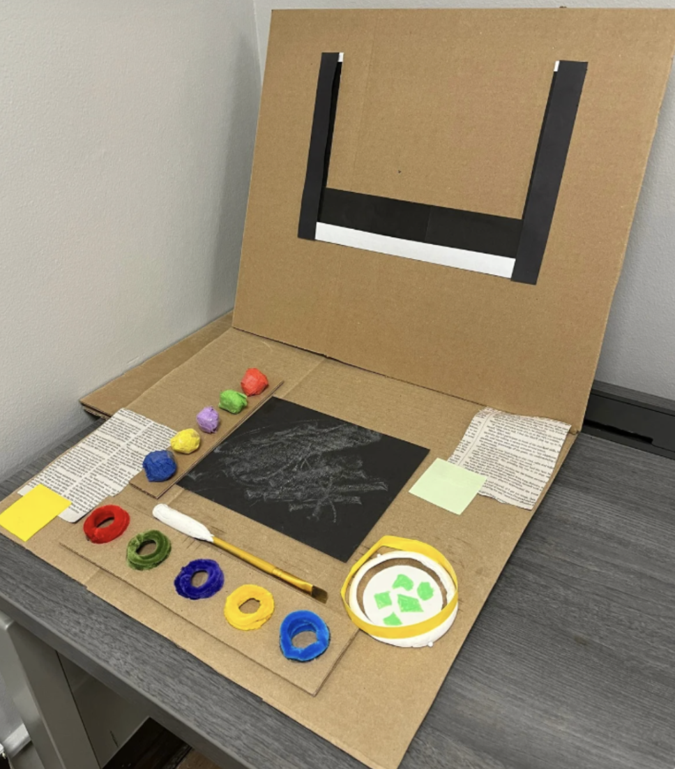 Figure 4: On-Site Concept Validation with Museum Guests and Exhibit Developers
Milestone 3: High-Fidelity Prototyping
Our final solution bridges digital screens and real-world archaeology into a seamless multi-sensory experience. Instead of abstract button clicks, the child acts as a true field researcher:
- Custom Dual-Ended Stylus: Features a rubber pestle end for grinding minerals and a brush end for coloring statues.
- Textured Mineral Buttons: Tactile buttons embedded directly into the table surface allow children to touch real mineral textures (malachite, azurite, cinnabar) before grinding them.
- Tactile Minigames: Replaces repetitive joystick tapping with engaging micro-tasks: dragging a pestle to crush minerals, tracing a line to crack an egg binder, and swiping to stir pigments.
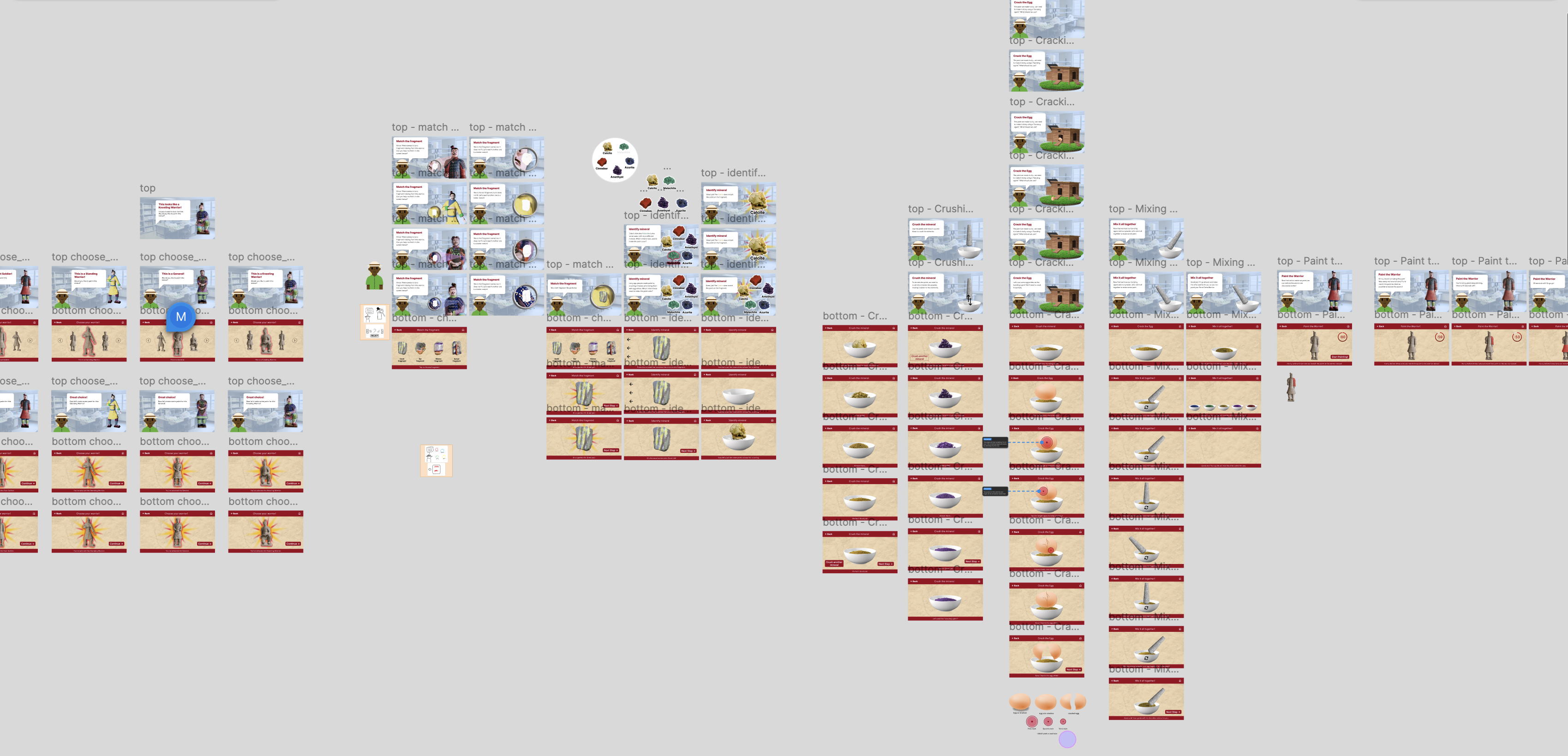 Figure 5: High-Fidelity Dual-Screen Interface System & Archeologist NPC Guide
Historical Authenticity: 60-Second Timed Oxidation Window
In real excavations, exposed ancient lacquer oxidizes and flakes away within seconds of contact with air. We gamified this historical reality into a 60-second painting challenge.
Caregivers read guidance and historical context from the upper screen while children paint their statue on the lower desk before time expires. This transformed a passive kiosk into a cooperative family race against the clock, achieving a 10/10 fun score in testing while fully meeting museum learning goals.
Project Scope & Constraints
Designing inside an active institution required navigating several strict engineering and ethical constraints:
- Fixed Learning Objectives: Museum educational standards were strictly locked. We had to rethink the journey without changing the historical facts or chemical steps (minerals, egg binders, oxidation).
- Ergonomic Requirements: The lower touchscreen and physical tools had to be reachable from a seated wheelchair position while remaining sturdy enough for heavy daily use by thousands of children.
- Youth Testing Protocols: Testing with minors required strict compliance, museum parental consent forms, requiring us to design child-friendly testing scripts.